
Overview of the DAT Loadboard for Truckers Application
- Company
- DAT Solutions
- Role
- Lead UX Designer
- Goal
- Help the product owner visualize the project completeness
I created this chart in Sketch to help the product owner (and the team) understand the scope of the project. We were in the middle of the project and it was difficult to visualize the work done and the work left to do. The product owner really liked this way of looking at the development.
I view this chart as a success, but also a frustration. It takes a lot of work to build a chart like this and maintain it. There aren’t tools yet that give you this kind of visualization and organization. Ideally I would like something like this:
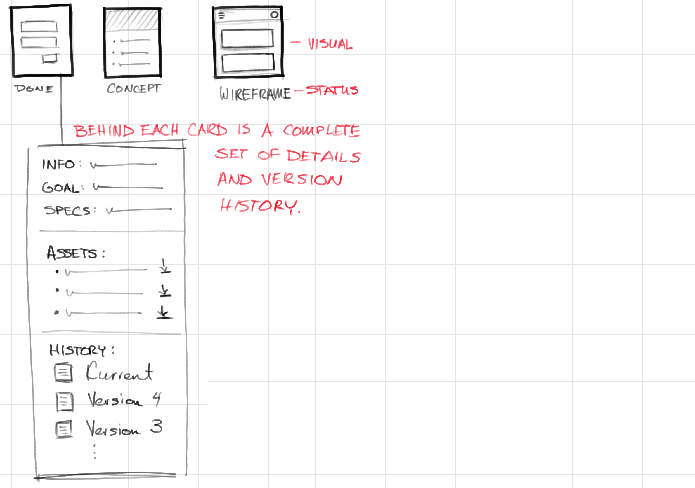
Each slot in the chart would have details about that screen. This could use a flexible system like Trello to customize what is useful for a given project. The final assets for a given screen would be linked here, along with the versioned history. Perhaps there could even be a snapshot command for the whole structure so the entire project could be rolled back if necessary. I can think of all kinds of features for an application like this.
Ideally you could switch between views. One view might show all screens at the same level to give a sense of the amount of total work. Another view would group the possible states for a screen to get a high level picture of an application.
A tool like this would be so useful in communicating project scope with management, especially with mobile apps. Mobile often seems simple. We all use mobile apps every day, so we’re very familiar with them. We learn the workflows and forget the complexity. Something like this helps visualize the real development scope. I wish I had time to write this app!