Peter Uchytil's Portfolio and Blog

Hi. I'm a UX Designer currently looking for a job. I've always had corporate jobs, not freelance, so I never spent time building up a portfolio. The examples of larger projects are internal to the companies I worked for, so I am highlighting some instances of design problems I have from my notes. Hopefully these examples illustrate my approach.

I will also write some regular blog articles on design and document some of my own projects to further illustrate my design skills. I hope you find something interesting here.

Show:

Mobile Visualization for Load Options

portfolio

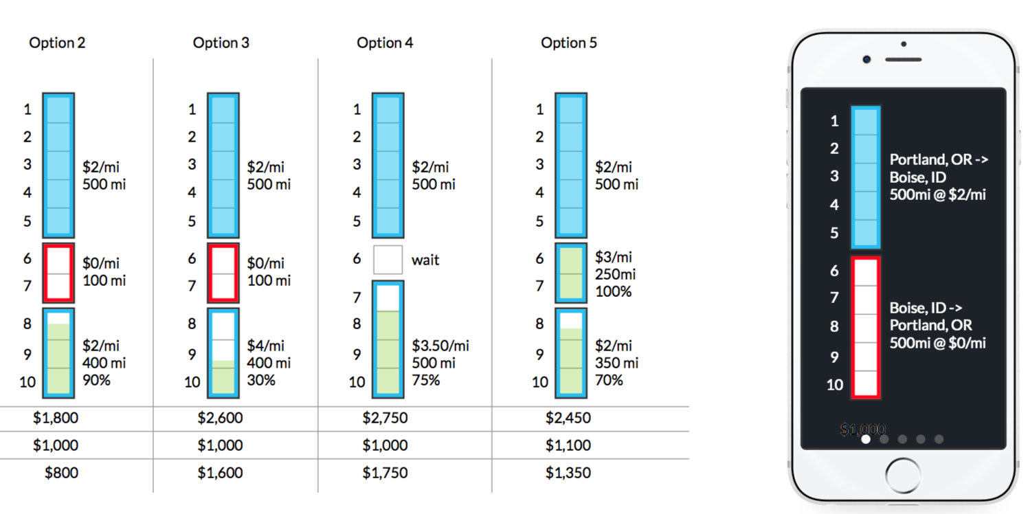
A carrier might have a full load one direction but needs a backhaul load so they aren’t running empty. Usually carriers look for a straight backhaul back to their starting point because it’s the easiest thing to find the way the information is currently presented. How do we help the users understand these are options?

Read More

Automatic Layer Naming in Pixelmator Pro

blog

Pixelmator Pro has a new feature that automatically names layers when images are added to a document. While this might seem like a parlor trick kind of feature, I think it’s actually an example of really good design.

Read More

Balancing Data with Intuition

blog

In Balancing Data with Intuition, Jon Yablonski breaks down when data is useful in design and illustrates what some of the pitfalls are. This is an excellent, short read. There’s a lot being written about data-driven design being superior to user-centric design. Like Yablonski, I’m not so sure.

Read More

Custom Salesforce dashboard for tracking revenue

portfolio

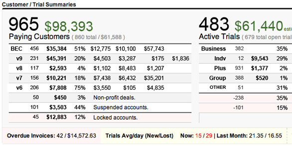
ProtoShare.com is a SaaS application with self-sign up. Sign-ups come with a free trial period. The customer funnel was custom built around Salesforce and this dashboard provided a way for management to understand current and future revenue.

Read More

Exploring button locations for cards

portfolio

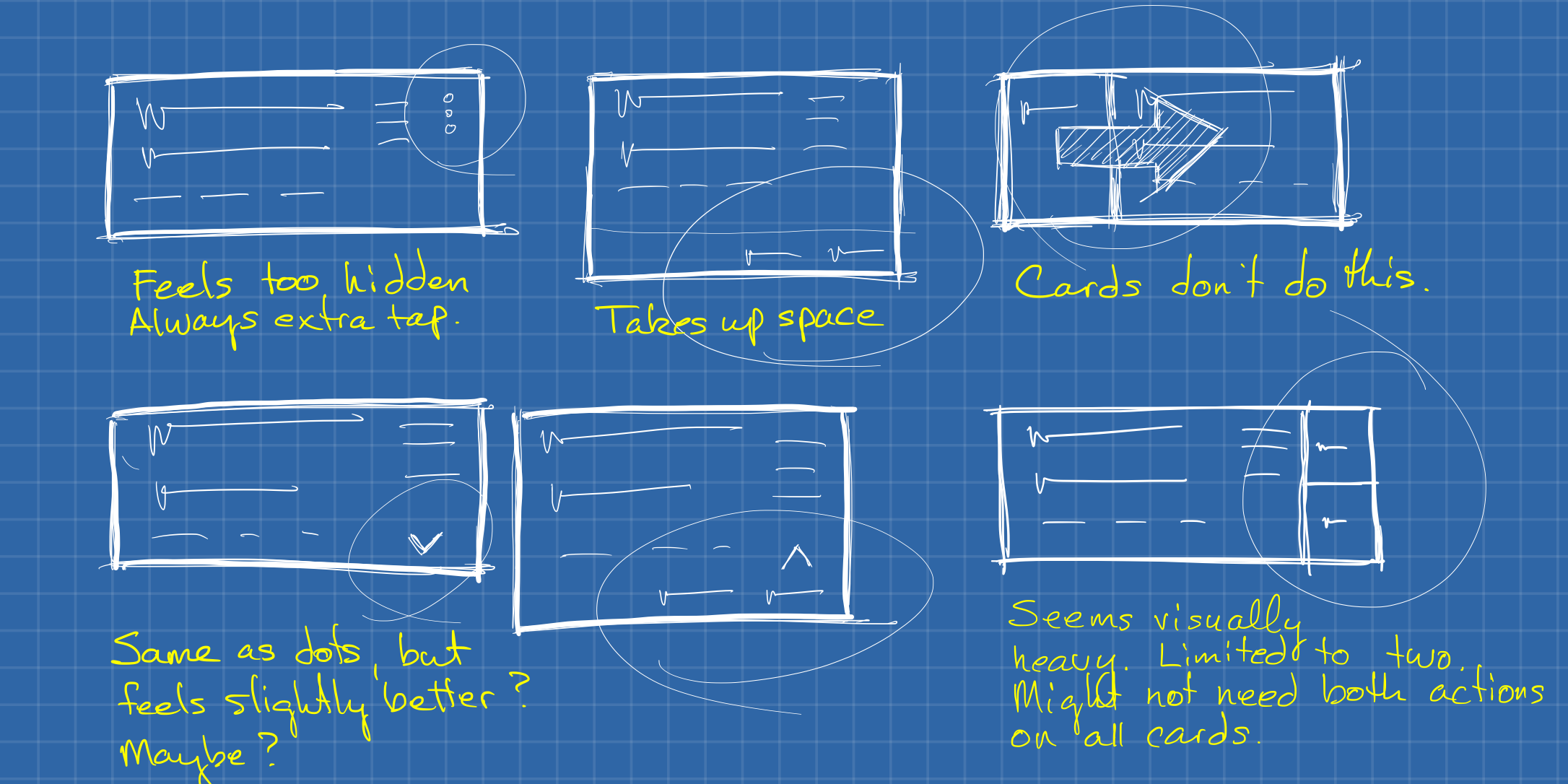
This is a simple example of exploring various card layouts. In the desktop applications, we didn’t use the card pattern, so we had to experiment. We used the Material Guidelines as a base.

Read More

Concept for "Trip Help" for load searches

portfolio

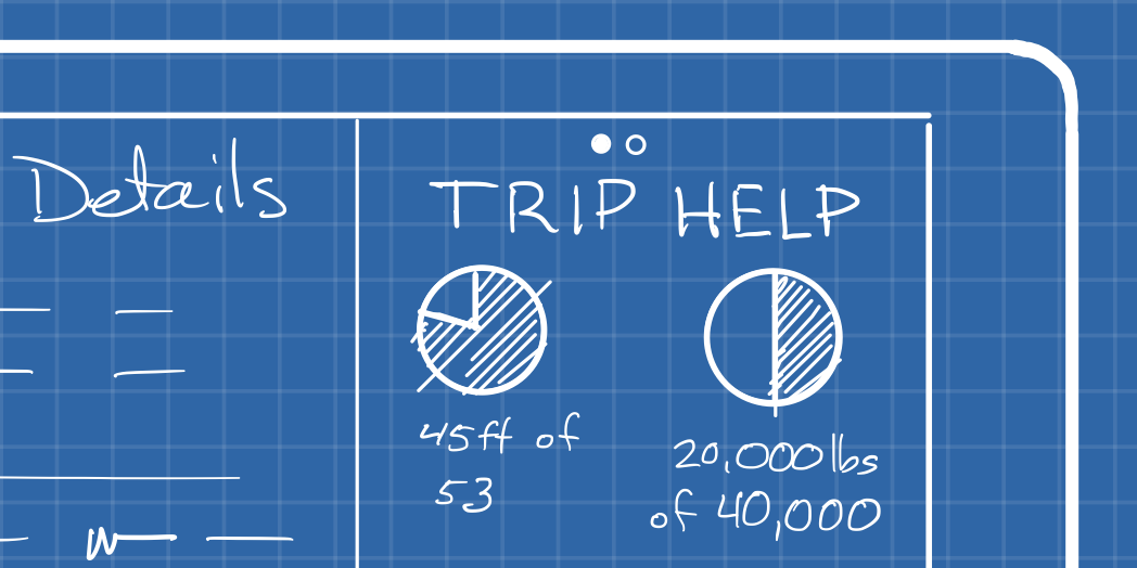
Booking loads is all about negotiation. As a carrier you want as much information as you can get to make an informed decision. In the current environment, the useful information is scattered. It would be helpful to consolidate and present data in a way that is quickly consumable to allow for better negotiations.

Read More

Comparison of Detail Layouts

portfolio

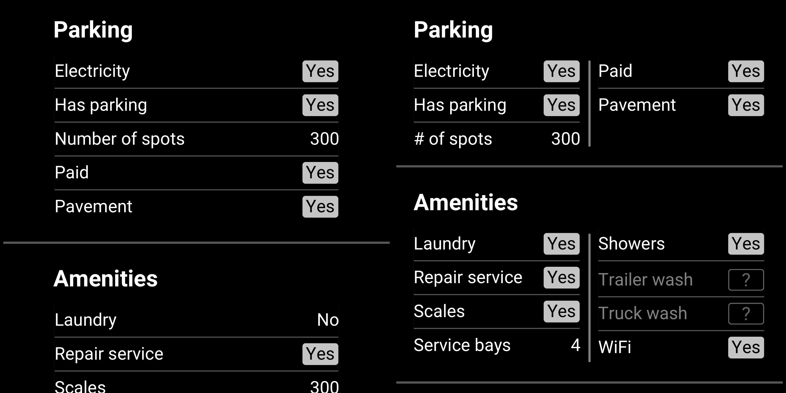
The DAT Trucker app includes a number of points of interest for truck drivers. In an update to the app, we wanted to improve the layout of the details page.

Read More

Concept for Improving Mobile Truck Posting/searching

portfolio

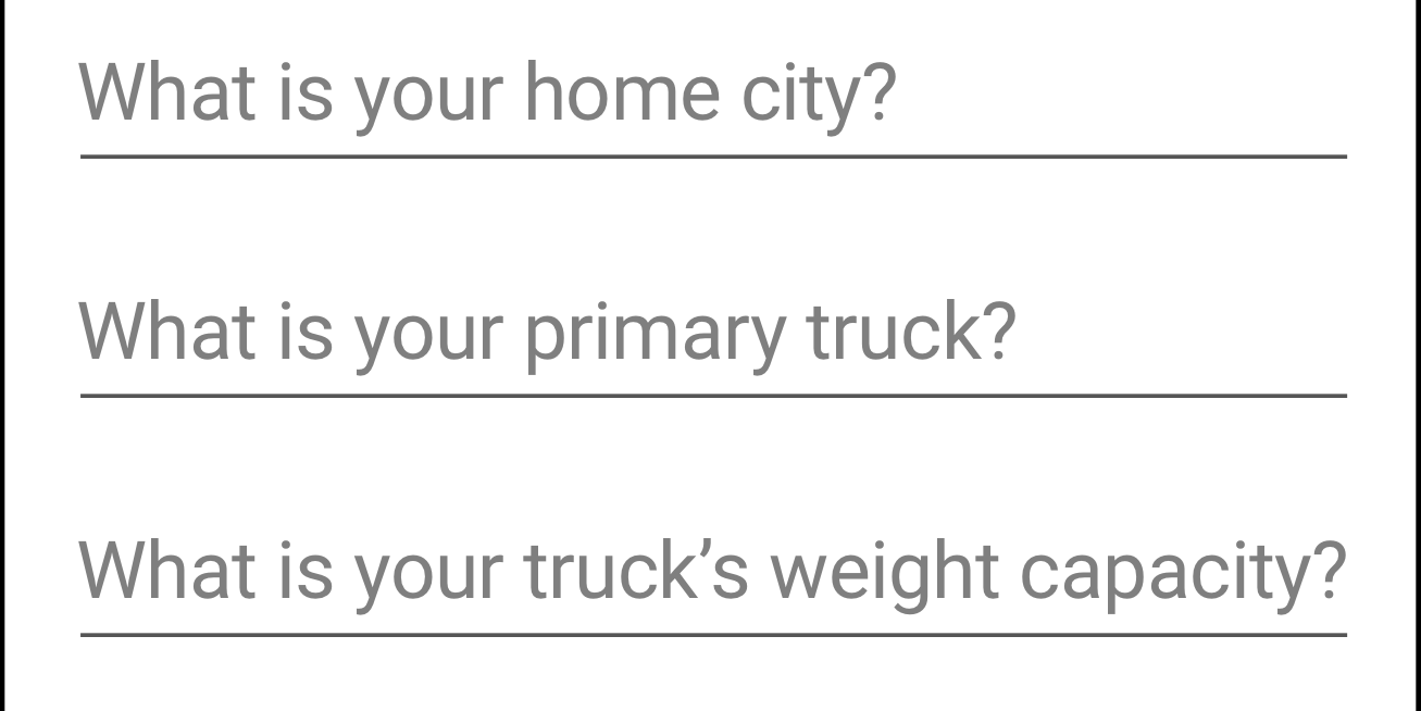
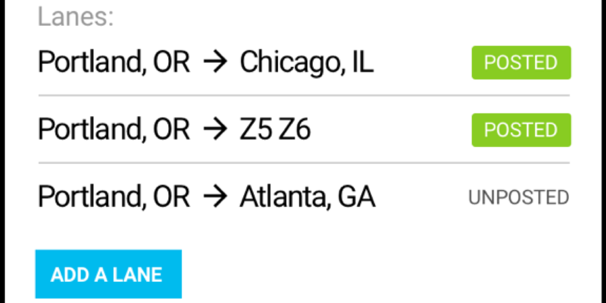
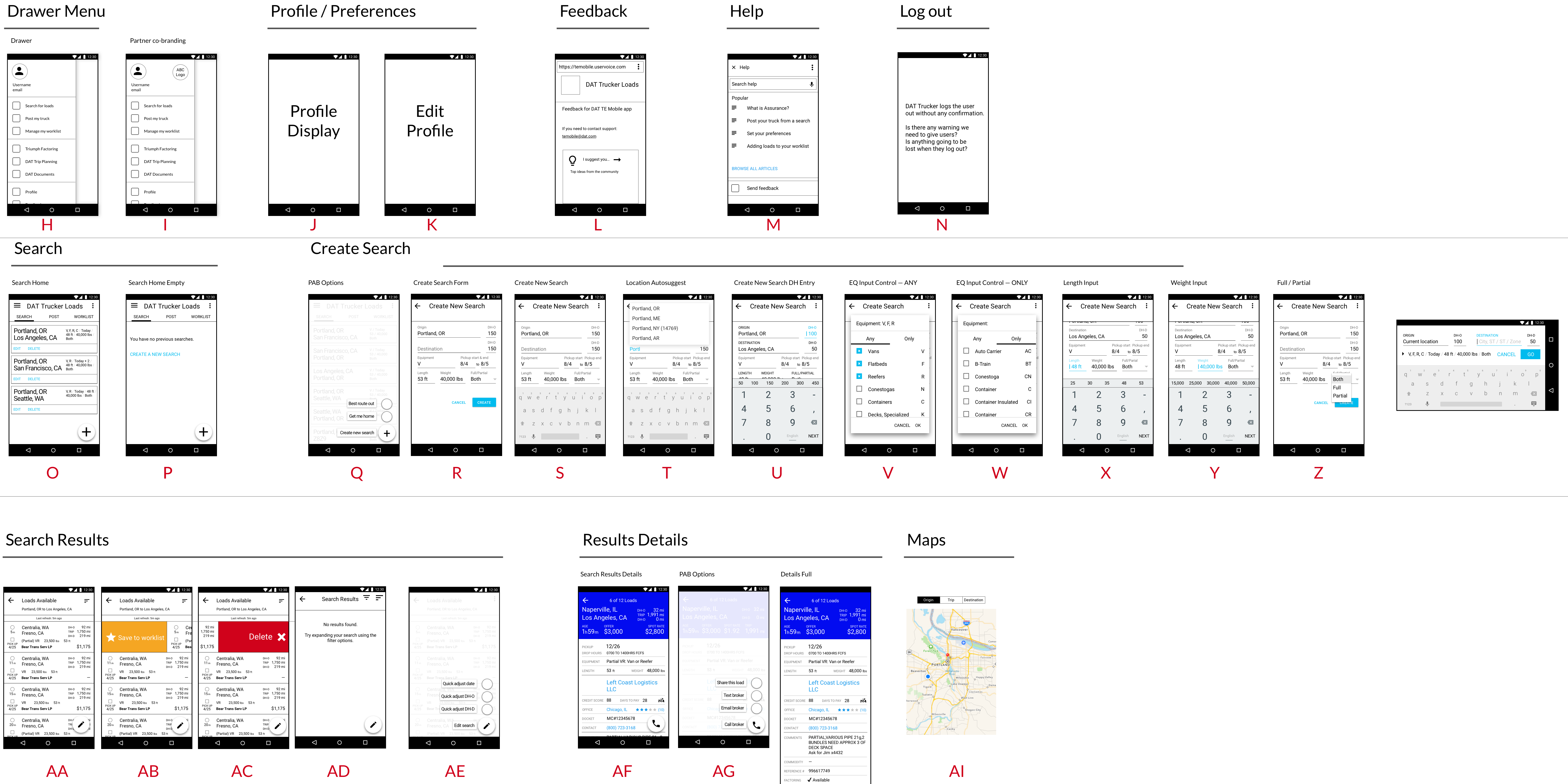
When DAT added mobile sizes to its carrier facing freight matching products, certain aspects of the workflow became clunky. As we admitted a driver’s workflow is different enough from a dispatcher’s, we were able to adjust the UI to better match the driver’s mental model.

Read More