
Comparison of Detail Layouts
- Company
- DAT Solutions
- Role
- Lead UX Designer
- Goal
- Design the details page for an item in the DAT Trucker database
Comparison of Detail Layouts
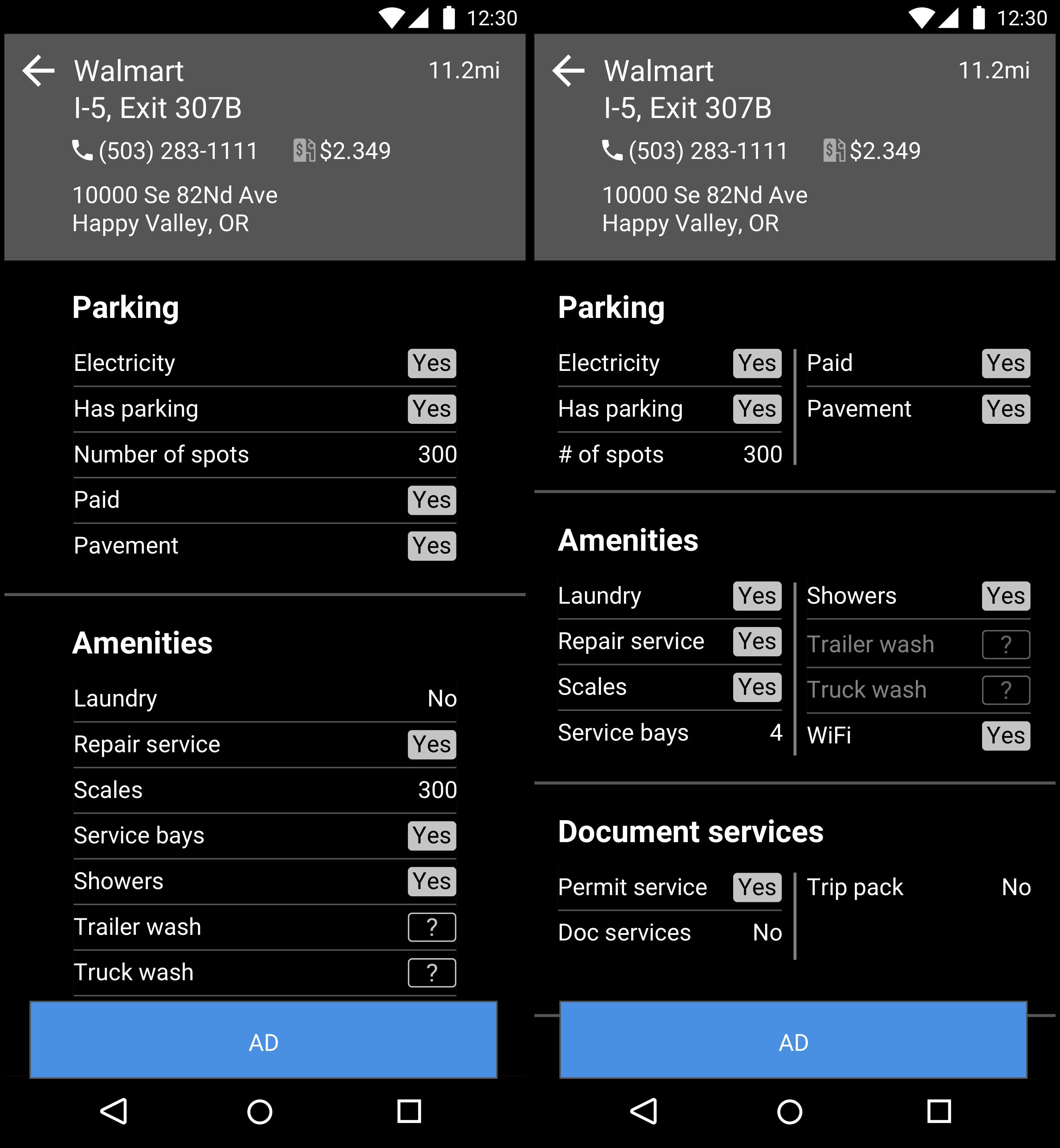
This is a wireframe for the DAT Trucker mobile app. As always with DAT apps, the struggle is to get the information density as high as possible, but still being readable. In this case, the denser layout on the right felt really good. Everyone liked it, but when tested for scan-ability, it fared worse than the straight list.
This was a close one because a lot of people really preferred the layout on the right. The scanning tests showed the layout on the left was better for scanning, but was it that much better? We expected users to interact with this screen a lot, so would they just learn the positions of items? Probably, but the items listed change for each detail page. Not all items apply to ally locations. Number of gas pumps doesn’t matter for a place that doesn’t sell gas. Also, the layout on the right works as long as lines don’t wrap. Part of what makes the layout pleasing is the symmetry of the rows. Because the user can change the text size and new items can be added to by the backend database, we couldn’t guarantee lines would never wrap. At least on the left we had more room to play with. Having items in each section listed in alphabetical order made it predictable on how to find any given item in a section.
If the data had been different, we may have gone with the layout on the right, but ultimately we decided the layout on the left was the most usable and flexible.