Concept for Improving Mobile Truck Posting/searching
- Company
- DAT Solutions
- Role
- Lead UX Designer
- Goal
- Improve/streamline the freight matching UI on mobile
DAT’s freight matching apps consist of brokers and carriers posting loads and trucks to a central database and then searching for matches. For years there were only desktop apps with dense spreadsheet like search results. Users got used to doing wide searches and visually filtering the results.
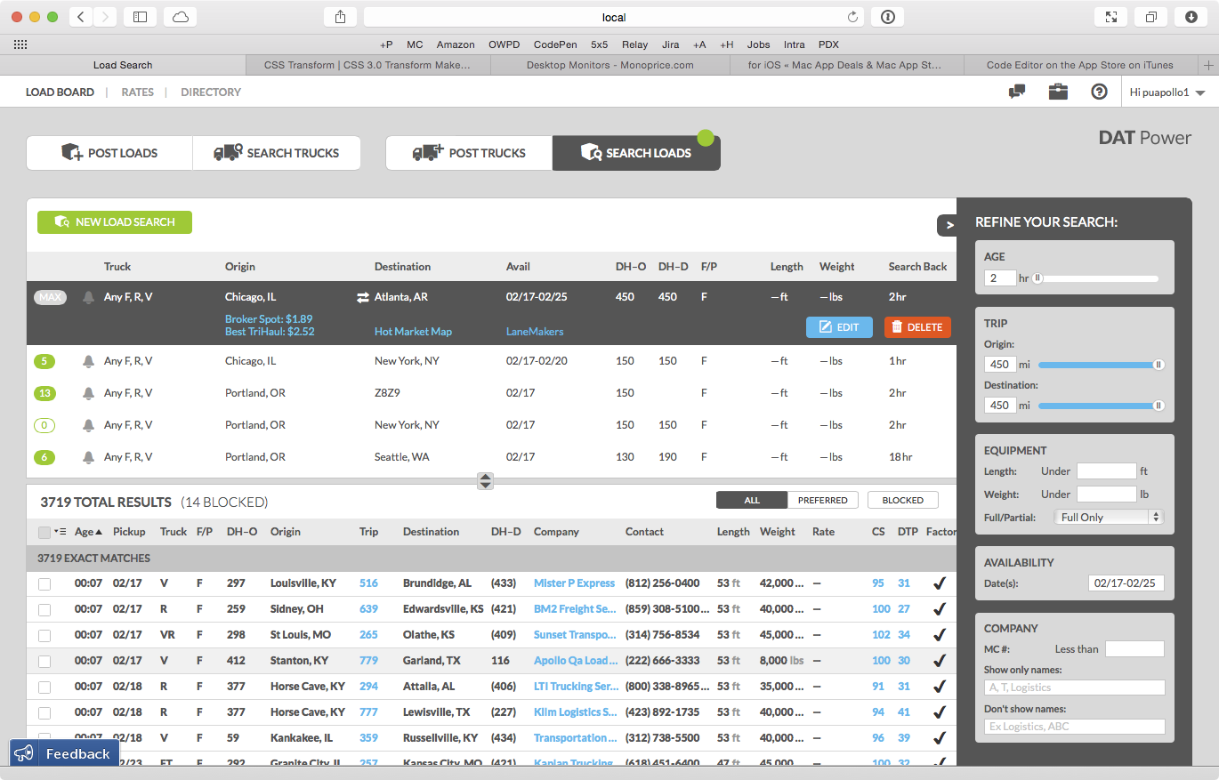
A search screen for DAT Power. The top half shows the search definitions and the bottom half shows the results of the selected search.
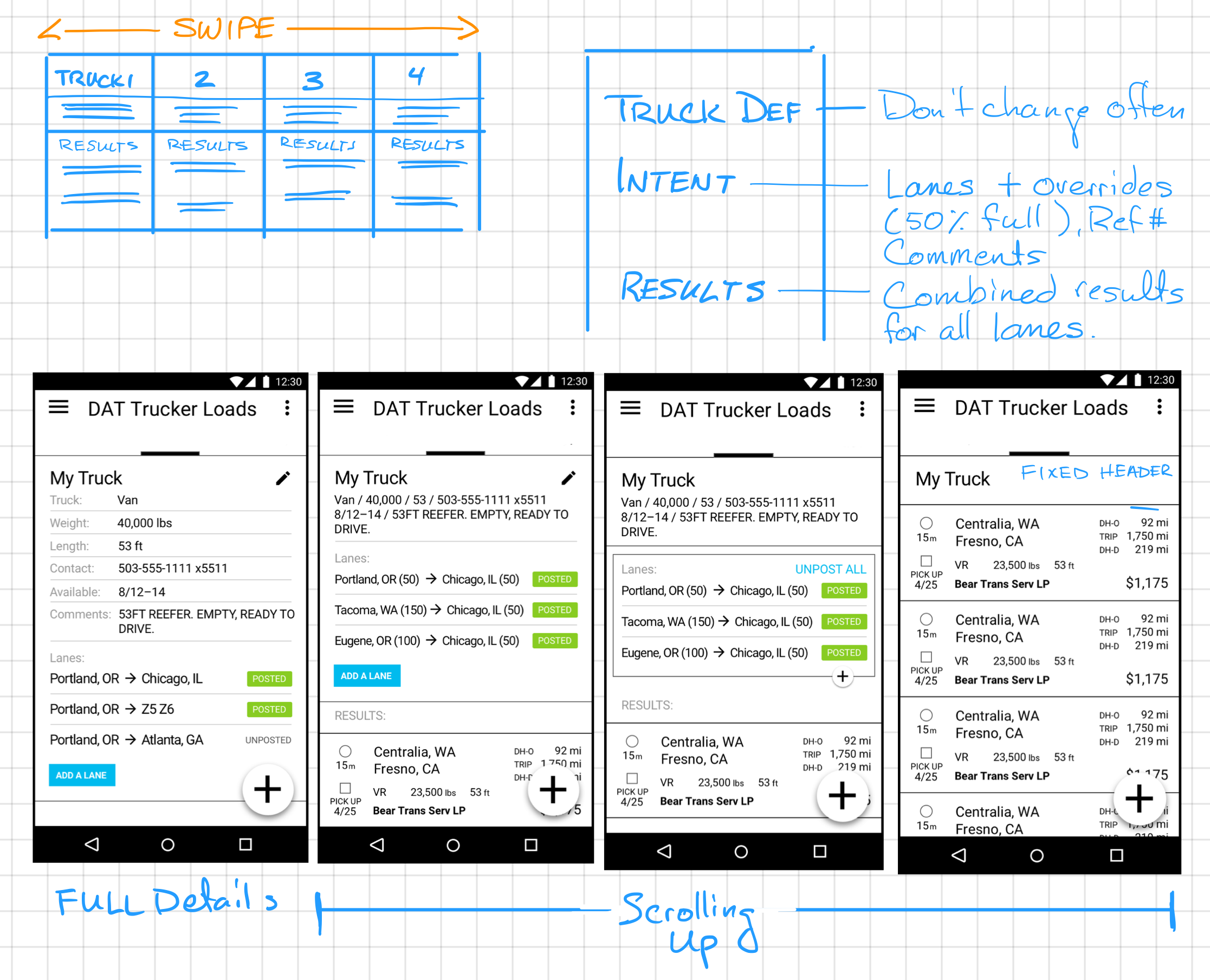
For simplicity’s sake, searching and posting was always split. Again, on the desktop, this wasn’t such a big deal, but on mobile we wanted to reduce the number of screens. Part of what made things easier was the fact that many of our mobile users were owner/operators. These are drivers who own a truck and find their own loads. These users weren’t dealing with multiple trucks, they had just a few, often only one.
When a driver is posting or searching, what they are really doing is expressing what equipment they have and where they are willing to go. Their equipment almost never changes, so really they are just changing where they want to go. We could simplify the UI and make it more personable by assuming the equipment doesn’t change and instead focus on where they want to go.
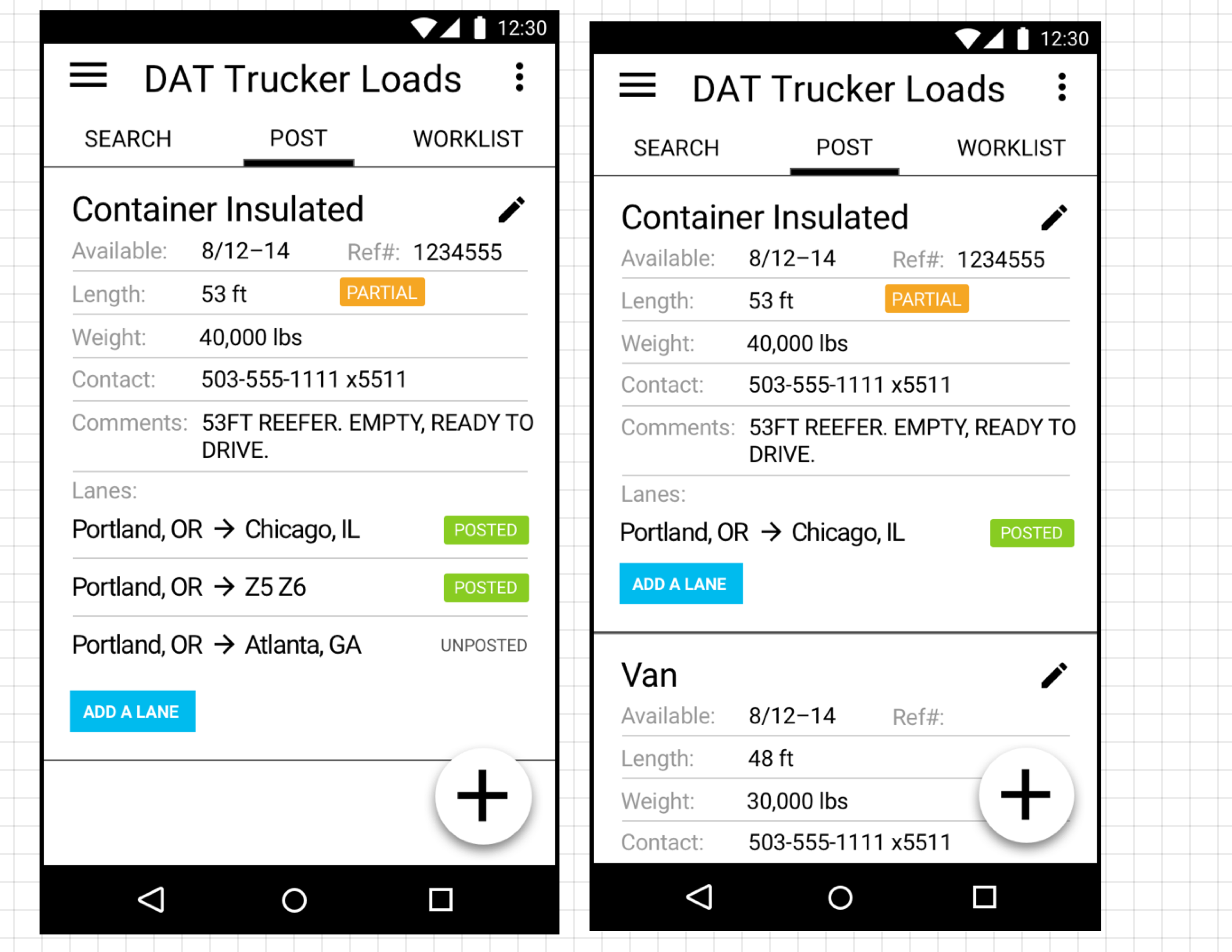
A concept for the revised mobile UI showing equipment on top with the lanes below, representing where the driver is willing to go. The wireframe on the right shows what it would look like if the driver had two trucks.
This was going to be the first step in updating the UI. As users got comfortable with it, we were then going to allow the truck information to be collapsed as well. Since it’s the driver’s own equipment, they probably don’t need to be reminded what it is all the time.
The lane display would have a toggle for the driver to post the truck to that lane. This would advertise the truck and make it findable in truck searches.
In the concept shown above, multiple trucks are on one screen and the user scrolls vertically to see them. In the option below, multiple trucks are accessed by swiping left and right. This would allow the vertical scroll to bring search results into view, thereby combining both the posting and searching UIs. This strengthened the intent driven model. Just specify where you want to go and check the results. If you don’t like what you see, easily advertise your truck by tapping lanes from unposted to posted.